
Overview
In today's age, UX designers can't be successful in finding roles without a solid online portfolio. The objective of Anna Roe | UX was to publish a portfolio website to showcase my process, work, and skills. Using my Frontend knowledge, I built my portfolio website from the ground up. Here is my process.
Goal
To build a responsive (mobile-first) UX portfolio website based on HCD methodology and showcase UX portfolio work and process to hiring/product managers.
My Process
Based on my research of successful UX design portfolios traits, I have applied a human-centered design (HCD) approach to build this UX portfolio website. In the process, I have improved my existing HTML (HyperText Markup Language), CSS (Cascading Style Sheets), and JS (JavaScript) skills.
My Tools
Figma - Atom - GitHub
Human-centered design (HCD) approach step by step:
RESEARCH
Keeping the goal of this website in mind, I started with a simple question:
What are hiring managers and product designers looking for in a successful UX portfolio?
I have combed the www for the top ten articles and carefully logged every UX-related skill keyword. Here are the top three UX-related skills to display for a UX portfolio success.


Based on this valuable knowledge, I have decided to detail my process in every UX project presented in my portfolio and emphasize visual design work throughout each task.
SKETCHES
Having a background in visual design, my initial impulse was to start sketching quick layouts of individual UX projects and this website as a whole.
Working with pen and paper while looking at fellow UX Designers’ websites allowed me to iterate on various ideas quickly.

INFORMATION ARCHITECTURE & SITE MAP
Keeping the goal to inform hiring and product managers of my UX processes, design skills, and career goals, I have decided on a flat navigation structure and a couple or so subpages for individual UX project pages.
Keeping a minimal viable product (MVP) sitemap simple will be a key for easy expansion as this UX portfolio site evolves.

WIREFRAMES - MOBILE-FIRST APPROACH
While improving my HTML/CSS skills using learning platforms such as Codecademy and Udemy, I realized some coding constraints. I decided to pursue a feasible yet impactful design that will allow any visitor to navigate UX portfolio content, process, and design easily.

CONTENT IN CODE EDITOR
Once I made rough sketches and gathered content I dove deep into the continuous improvement cycle following Lean methodology principles while adding content into HTML and using CSS to style it.

GitHub Repository:
Check out Anna Roe | UX portfolio website public code here.
DESIGN LANGUAGE
Design language's goal was to make an objective website flow for optimal navigation. That way, anyone visiting the portfolio website can easily navigate through and find any information in less than three clicks.
For that reason, I decided on a monochromatic colors scheme to focus on the information at hand without unnecessary distraction.
I have chosen the yellow color to symbolize intellect, positivity, and creativity. Type legibility and readability were of high importance as they aligned with the goal of Anna Roe | UX portfolio website.
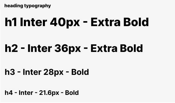

DESIGN SYSTEM IN FIGMA
I have also set up a Design System in Figma for future color and type attributes iterations. That way, I can quickly test the feel of various colors and typography.
USER TESTING
Now that Anna Roe | UX has been styled, I set up thorough user testing. First, I conducted a two-question survey followed by qualitative testing via Zoom, with five participants picked based on specific recruitment criteria:
- Age: between 18 to 65
- Technical Experience: medium to high
- Device: owns a smartphone and laptop/desktop
- Job: works digitally or uses online tools daily
- Habits: views people's professional websites

Starting Situation
You’re the Head of Design in a digital agency in the US. You’re currently expanding your UX team and are looking for a junior UI designer with front-end coding skills. Through LinkedIn, you found Anna Roe. You want to take a closer look at her online portfolio to understand her style and personality.
Test participants were given three scenarios to complete. At the same time, I recorded and observed their behavior around the website’s usability, and I followed up with open-ended questions regarding the website’s visual design.
Testing Scenarios
Scenario 1: You now want to know more about one of her projects called BALANCE, a wellness app for busy professionals. Where do you think you can find more information about that project? What was the project about?
Scenario 2:You’ve browsed through the project and become more interested in her former education and experiences. Now, you want to see her resume. Where do you think you can find it?
Scenario 3: You’ve downloaded the resume and want to reach out to her to share the current job opening. How might you proceed?

I have recorded research results using Nielsen Norman Group’s severity rating scale 0-4. The severity of a usability problem is a combination of three factors:
- The frequency with which the problem occurs: Is it common or rare?
- If it happens, the impact of the problem: Will it be easy or difficult for the users to overcome?
- The persistence of the problem: Is it a one-time problem that users can overcome once they know about it, or will users repeatedly be bothered by the problem?

Based on user testing data of 80% of users viewing this website on a desktop, I have added a double-column width for devices larger than mobile screens. Additionally, I have further styled the footer section enhancing “Let’s connect” visibility.

ACCESSIBILITY - CODE QUALITY&CROSS BROWSER TESTING

ANNA ROE | UX
